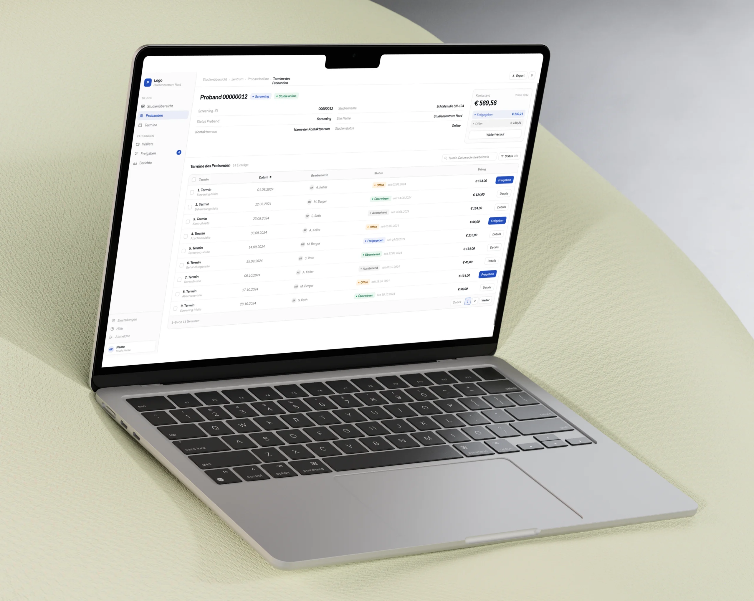
Trigonos ZT GmbH · Geomonitoring
Decades of geodata, one decision interface.
As the first designer I set the information architecture, dashboard, the design system foundation from zero with eight custom chart types, and made client access the centre of the product.
It has been in daily use since 2021.

Impact
- 2021Live sinceThe system has been used daily since its first release.
- 0 → 1Product and design foundationInformation architecture, interactive dashboard and components started from zero.
- 3RolesField engineers, analysis teams and clients use the same data and dashboard at different levels of detail.
- MillionsGeomonitoring data made interactiveLong measurement histories are made usable from overview to individual value.
Overview
Context
Trigonos monitors displacement and deformation in natural and built structures.
Product goal
Turn ongoing measurement data into one digital product for field work, expert analysis and client reporting.
Starting point
The data and existing systems were available.
The workflow still depended on manual steps and manually prepared reports.
Evidence base
Data analysis, existing-system review, team pain points, content requirements and feature requirements.
Solution
- One interactive dashboard, three role-specific views.
- One Design System Foundation.
Outcome
The system is used daily.
Its information architecture and component foundation still carry the product.
01 · Starting point
Product AnalysisInformation Architecture
The data existed. The product did not.
Geomonitoring produces continuous measurements that must be understood over time.
Trigonos already had the technical expertise, the measurement data and the operating processes.
What was missing was one product that connected them.
I reviewed the existing systems, data structures, available content and the pain points described by the team.
The work began with the actual data and the decisions the system had to support.
The goal was not a generic dashboard.
The product had to make complex measurement histories usable without removing the detail required for professional analysis.
Journey mapping · current state
02 · Three professional views
Role-Based UXSystem Thinking
One database had to support three different jobs.
Field engineers update and review current readings on site, under changing conditions.
The analysis team needs the complete historical data set to compare movement and assess changes.
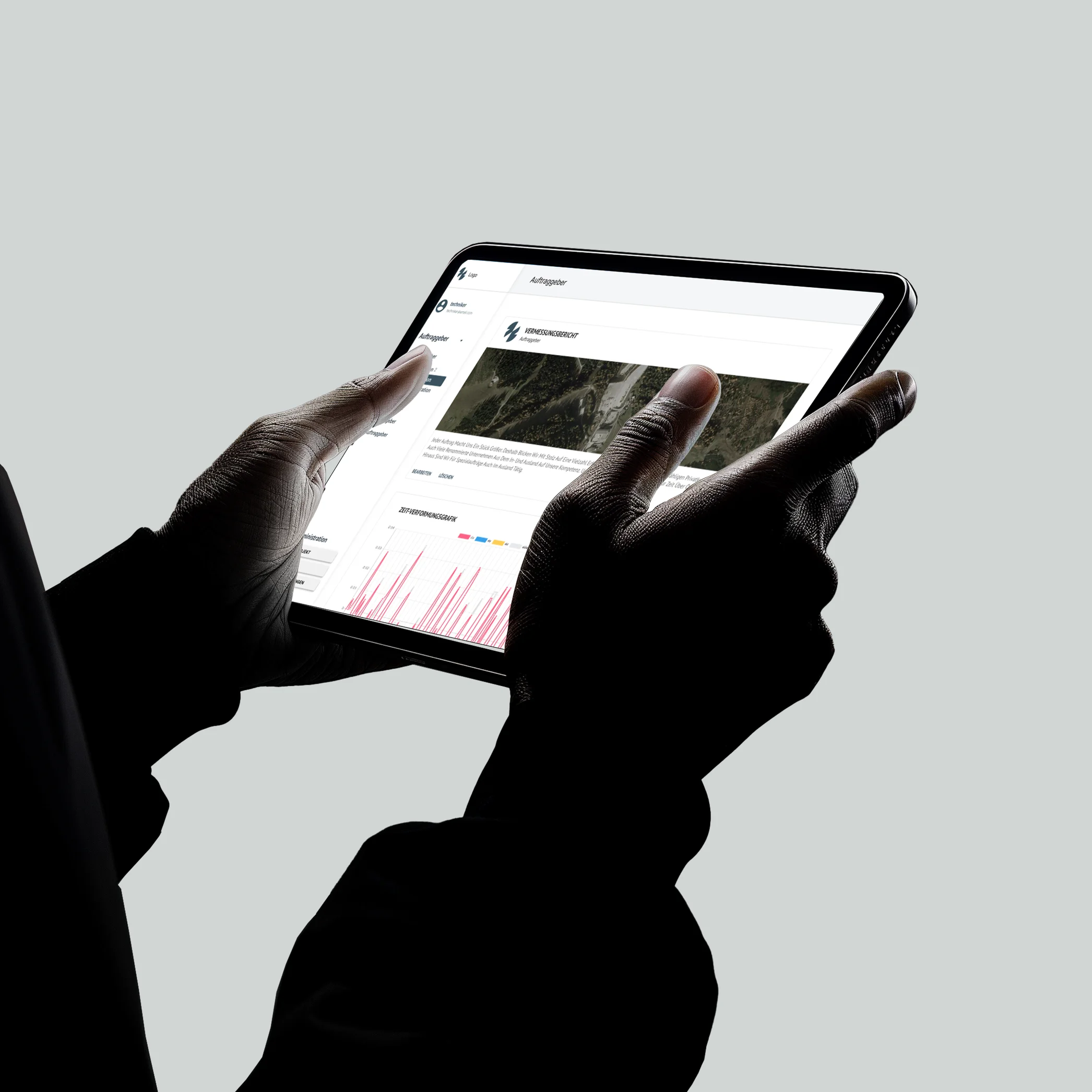
Clients need the analysis as a clear, interactive report that supports further measures and decisions.
The three groups did not need three separate products.
They needed different depth, timing and actions from the same data.
I used one project structure and adapted the interface to each role.
I first mapped the data, user roles and workflows, then designed the dashboard around them.
What the three groups need
Current readings, on site, in real time.
The complete history, compared over time.
The analysis as an interactive report.
03 · Data hierarchy
Data VisualisationInteraction Design
The product moves from overview to the individual measurement.
Millions of datapoints cannot be shown at one level of detail.
The interface therefore moves through a clear hierarchy: project overview, time-based analysis, and the individual measurement with its context.
Charts show movement and patterns over time.
Detailed views keep each value accessible when an analyst needs to inspect the source. The structure stays consistent while the density changes.
This makes the complete history available to the analysis team without turning the client view into an expert tool.
Wireframe · the interface reacts
Interactive wireframe · survey report
Survey report
04 · Continuous reporting
Client ExperienceProduct Structure
Client reporting became a view of the same data.
Before the system, reporting still required manual steps.
The product connected measurement, analysis and presentation inside one project structure.
Clients receive a report-oriented view based on the same data used by field and analysis teams.
A change entered or assessed inside the system remains connected to the client view instead of being copied into a separate document.
The product did not include an alerting system in this scope.
The focus was clear access to current and historical measurement data.
Working data and client reporting were designed as one continuous product.
Future state journey mapping
05 · Design foundation and implementation
Design SystemsDesign and Engineering
The product foundation was created before the full system was developed.
I designed the information architecture, dashboard patterns and component library from zero.
The components were implemented, and I continued to resolve usability issues and optimise features as development progressed.
The same foundation still supports the system.
Navigation, project hierarchy, chart patterns and component logic were designed as a system rather than as isolated pages.
The handover provided a clear basis for continued product development.
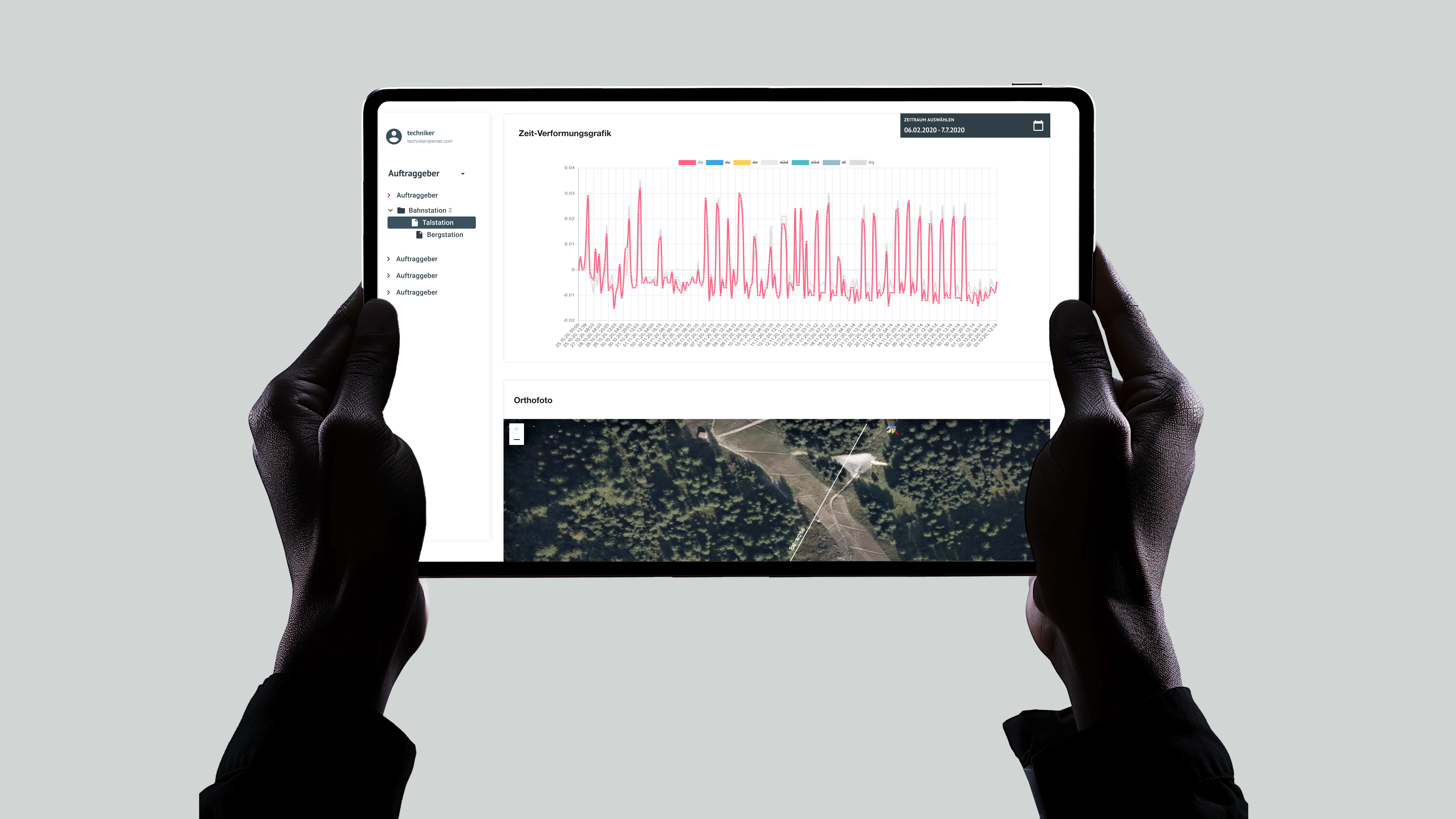
Eight custom chart types
- Time series chartDecades of data, analysed in real time
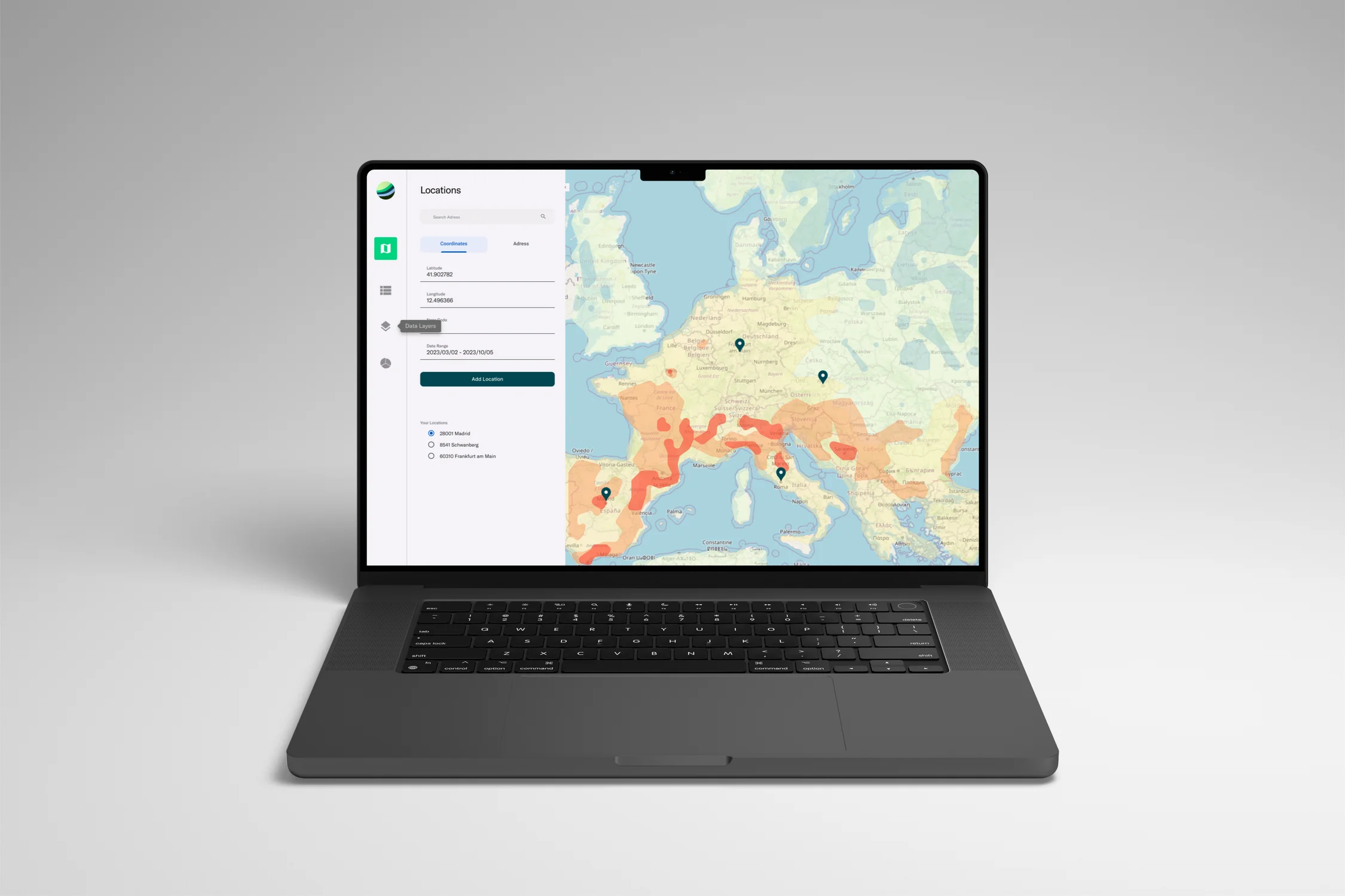
- Map chartOrthophoto and terrain as context
- Deformation over timeBuilt specifically for deformation
- Movement scatterplotHorizontal and vertical movement per point
- Vector graphicDirection and strength of movement
- Webcam with historyLive image and image archive on site
- Role batteryStates at a glance, per role
- Sensor placementSensors located in the orthophoto
06 · Outcome
The system has been in daily use since 2021.
Engineering teams, analysts and clients work from the same product. The information architecture, dashboard structure and component foundation remain in use.
A product designed from zero became a daily operational tool and remained structurally stable over several years.
07 · My contribution
The biggest challenge in the design process was not simply to visualise the big data. Rather, it was about how the meaning of that same data had to change as fieldwork progressed, during the analysis phase, and as client decisions were made.
- Product structureDefined the project hierarchy and the relationship between field work, analysis and reporting.
- Dashboard and role viewsDesigned the core dashboard and adapted actions and detail levels for three professional groups.
- Data visualisationCreated the hierarchy from project overview to time history and individual measurement.
- Design foundationBuilt the component system and supported implementation and later feature optimisation.
More projects
What else I have built.
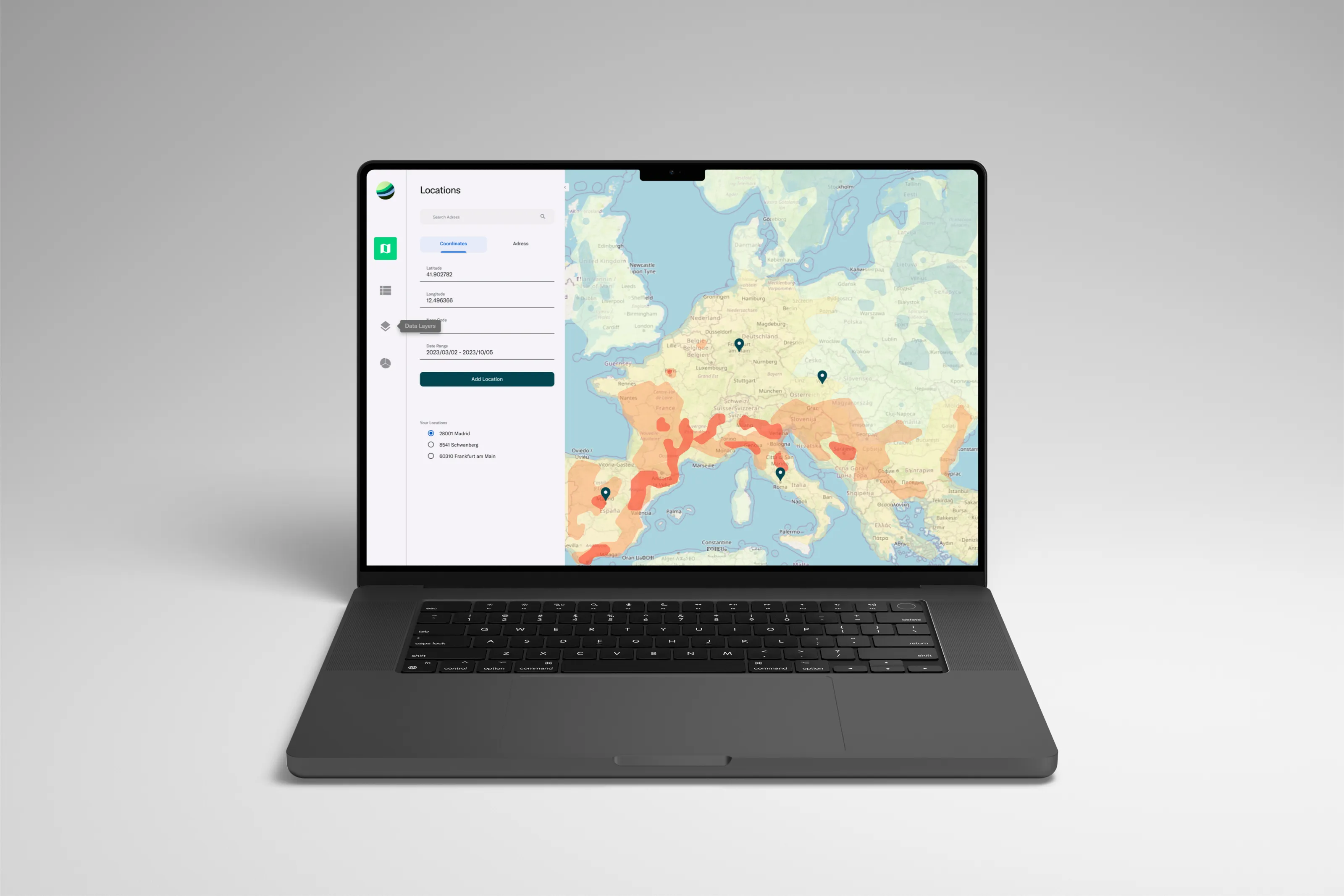 RefinqFrom a pitch deck to a funded product.I turned existing research and founder input into an interactive funding prototype and a documented design foundation.
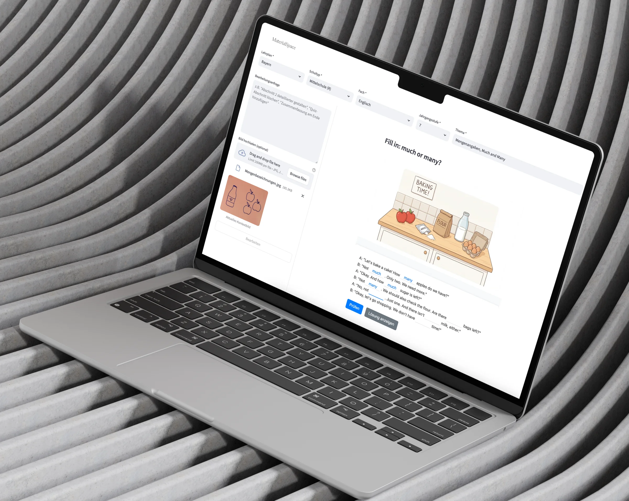
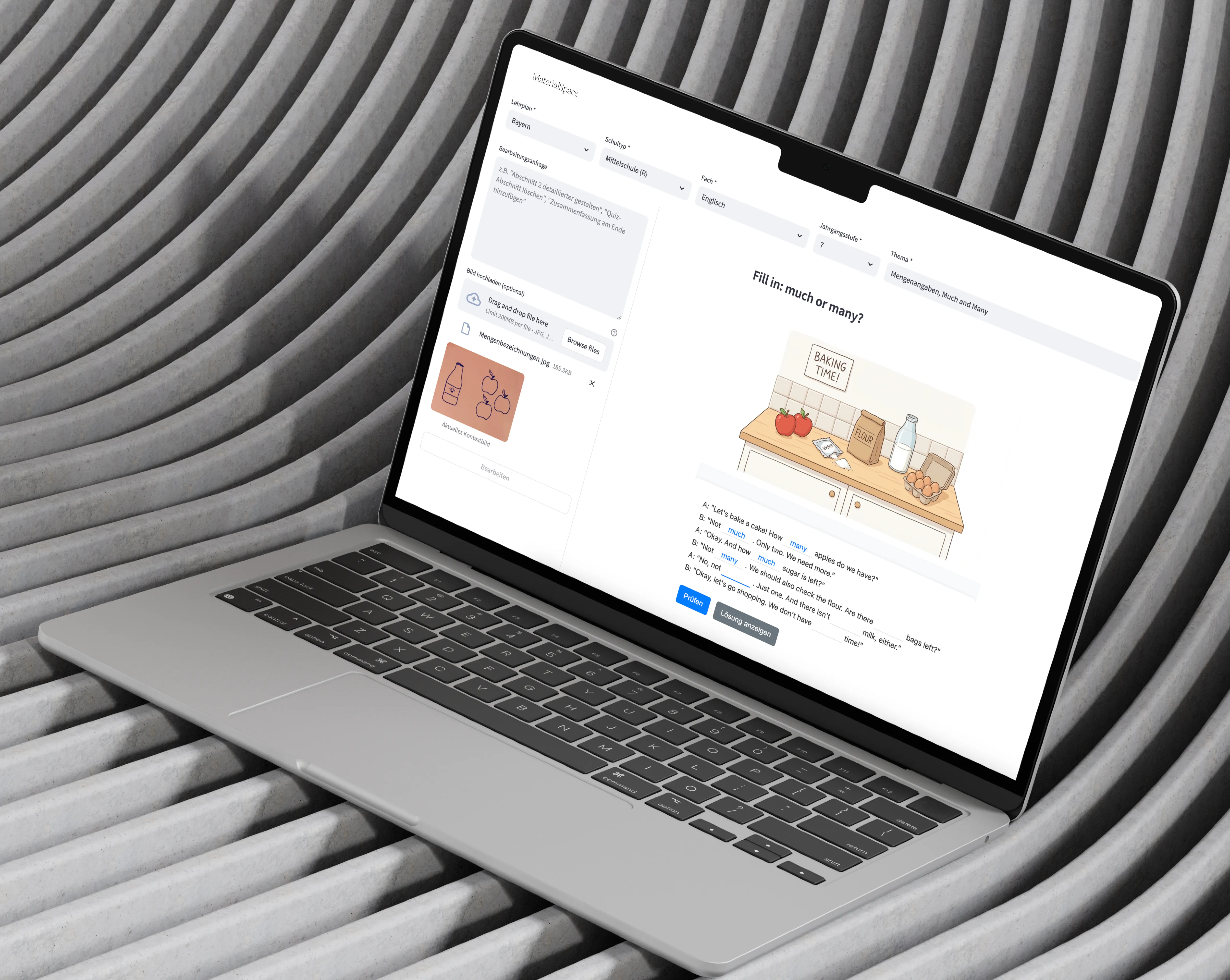 MaterialSpaceTrust decides whether an AI product gets used.I replaced prompting with structured interaction and validated the approach with 60 participants.
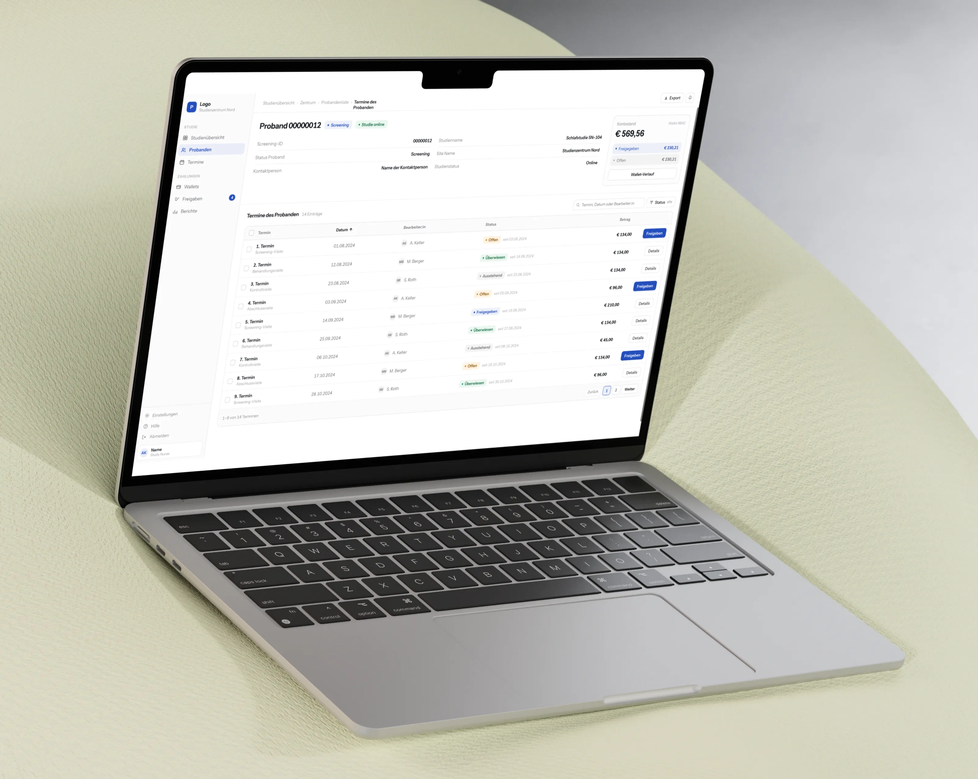 ProbandoOne startup, four projects, one bottleneck.I improved the internal dashboard and public website, rebuilt the design foundation they exposed as a delivery problem, and then designed their payment system from zero.